The Need
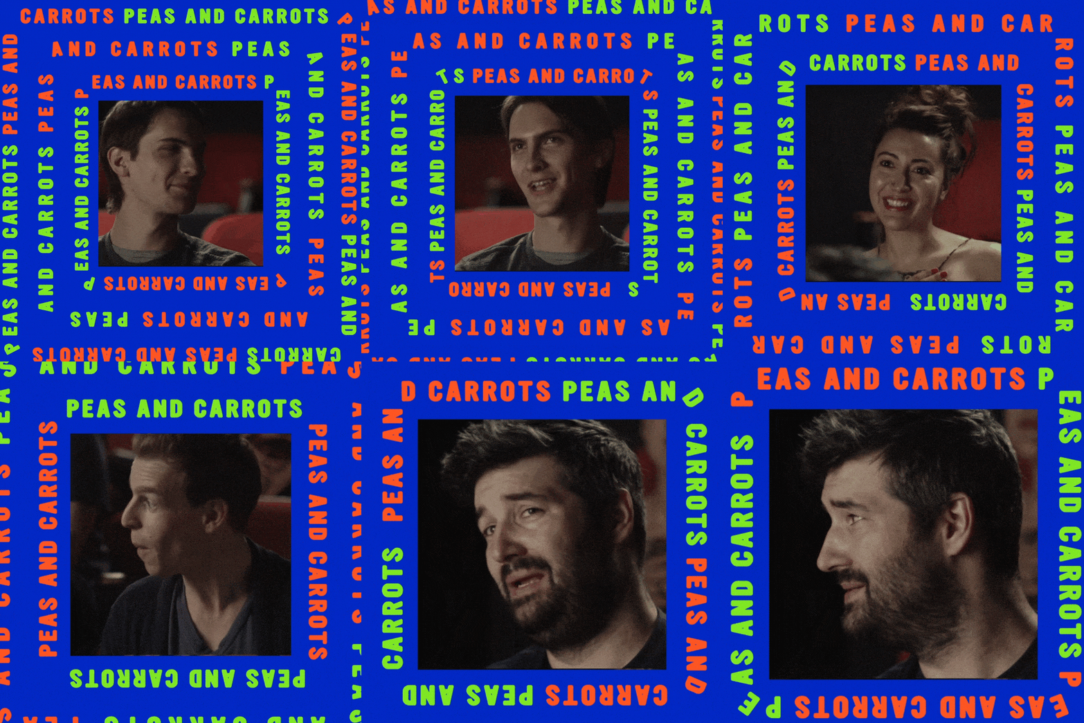
A vibrant brand expression, as unique and different as the concept of a new mobile-first streaming platform.
(Trust me, at the time, this was a semi-unique idea. It was a pre-Quibi attempt at television you were supposed to watch on your phone.)

Brand ID — Brand Positioning — Tagline — Organic Social — Launch Content —
Brand ID — Brand Positioning — Tagline — Organic Social — Launch Content —
Ficto was a short-form mobile streaming app for curated creator-driven content. As a direct competitor to the much-better-funded Quibi, we decided to zig where Quibi went the straight and predictable. We crafted a brand line that spoke to the need for inviting content: Created for Humans. And an engaging, diverse voice and tone that reflected its target audience: EVERYONE. Or at least everyone that wasn’t a blue-blooded Hollywood elite.
We started with “Dynamic Branding”
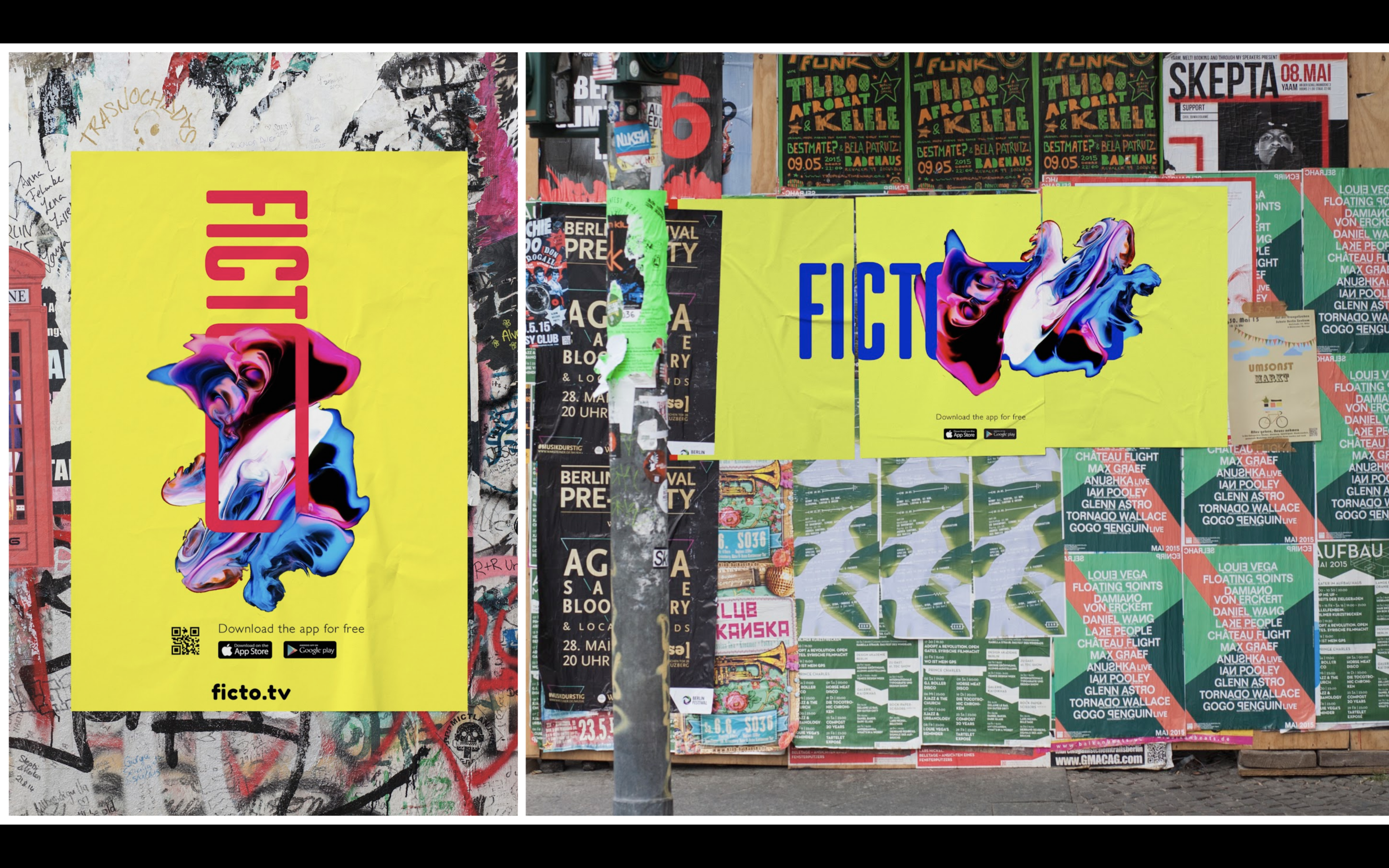
Our logo would change depending on the orientation of the asset.
Vertical format = Vertical O
Horizontal format = Horizontal O
We built the mission statement, manifesto, brand positioning, and content strategy that would inform the style guide and campaign. Our team was especially passionate about this brand's commitment to being the platform for untold stories from lesser-heard voices.
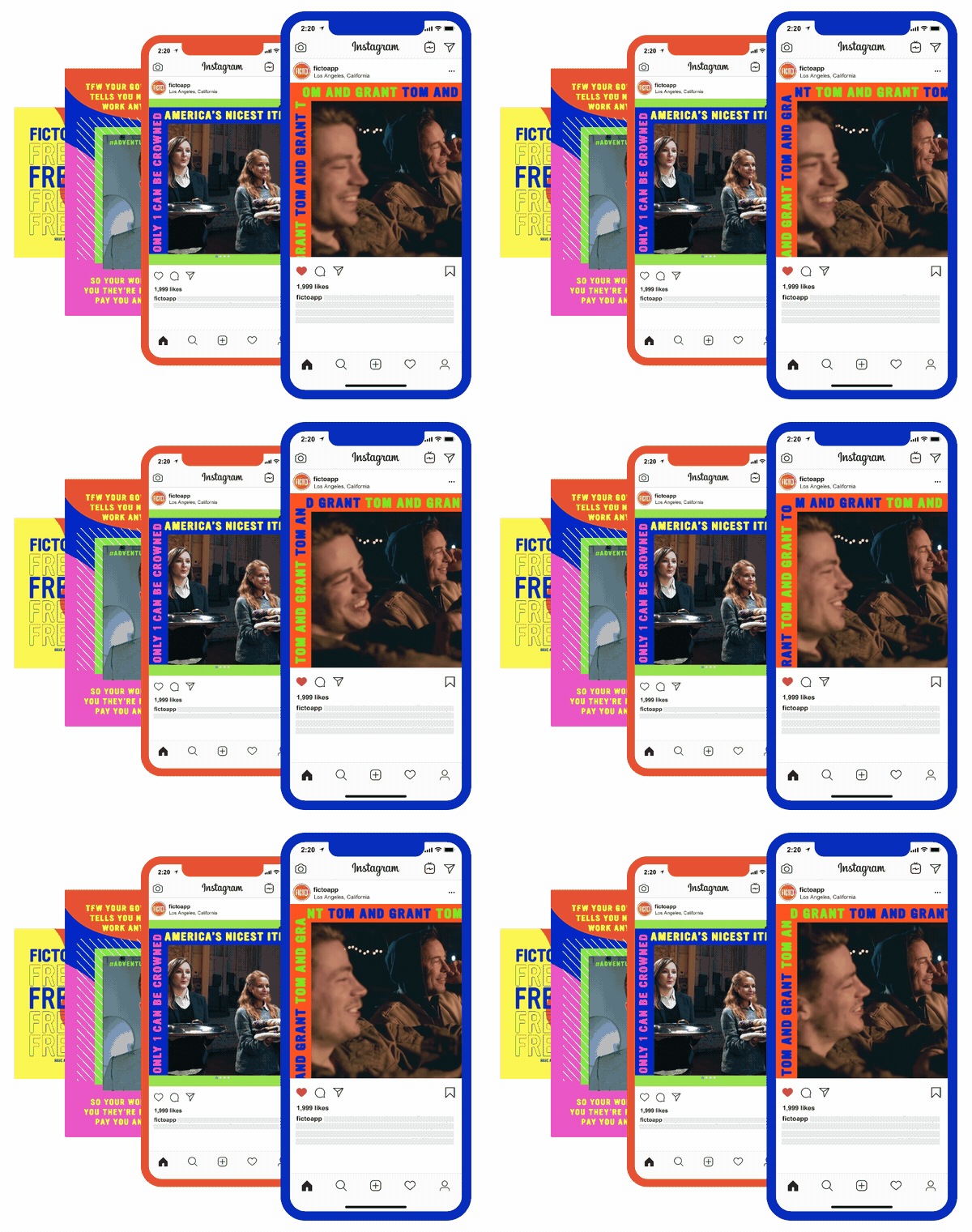
With a very small budget (and no paid media, gulp) we were able to grow the social audience and boost downloads through interactive and engaging social, newsletters, community management, and an irreverent edgy tone of voice that matched the envelope-pushing catalog of content.
Also, Snoop Dogg.


(And some OOH that never happened because 2020 was fun’t)


